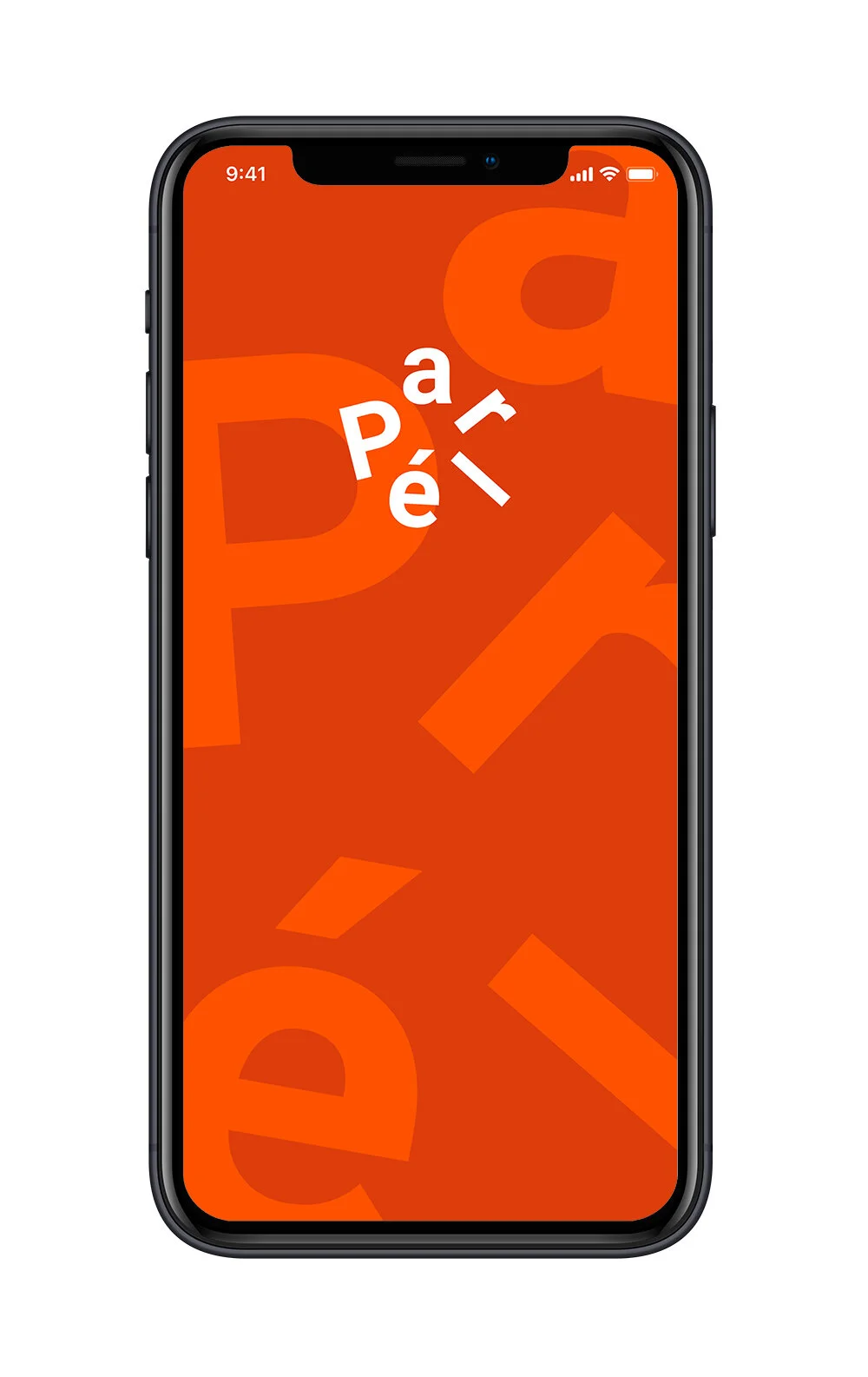
Parlé—A restaurant experience designed for group conversations.
Summary
Parlé is a restaurant where ordering and bill-splitting are part of the online booking process happening before guests enter the restaurant.
Creating a smooth, transaction-less experience and calm atmosphere. Free of interruptions, -perfect for conversations.
Aug-Nov 2019. UX & UI Design, Service Blueprinting. Illustrator, Photoshop, XD. Personal Project, Portfolio.
Key Features
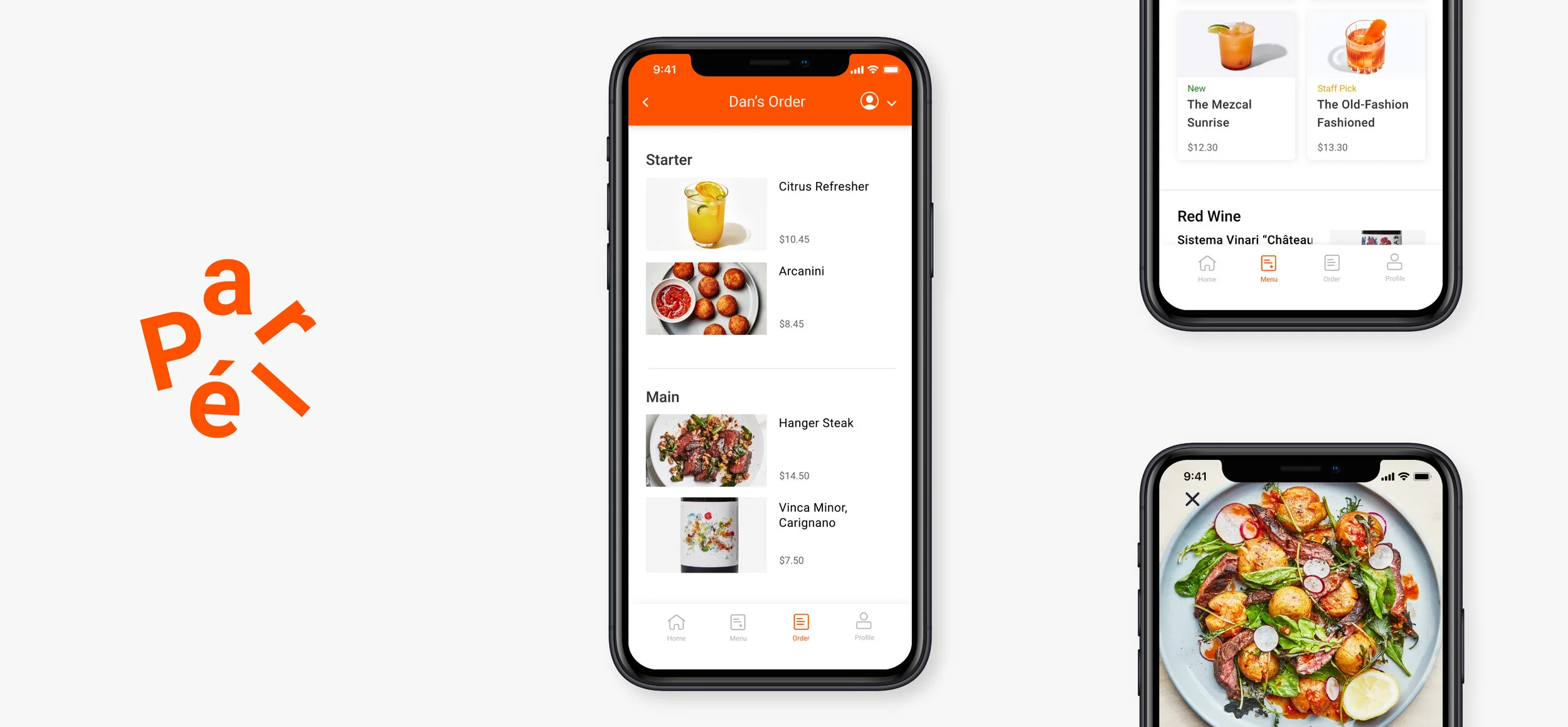
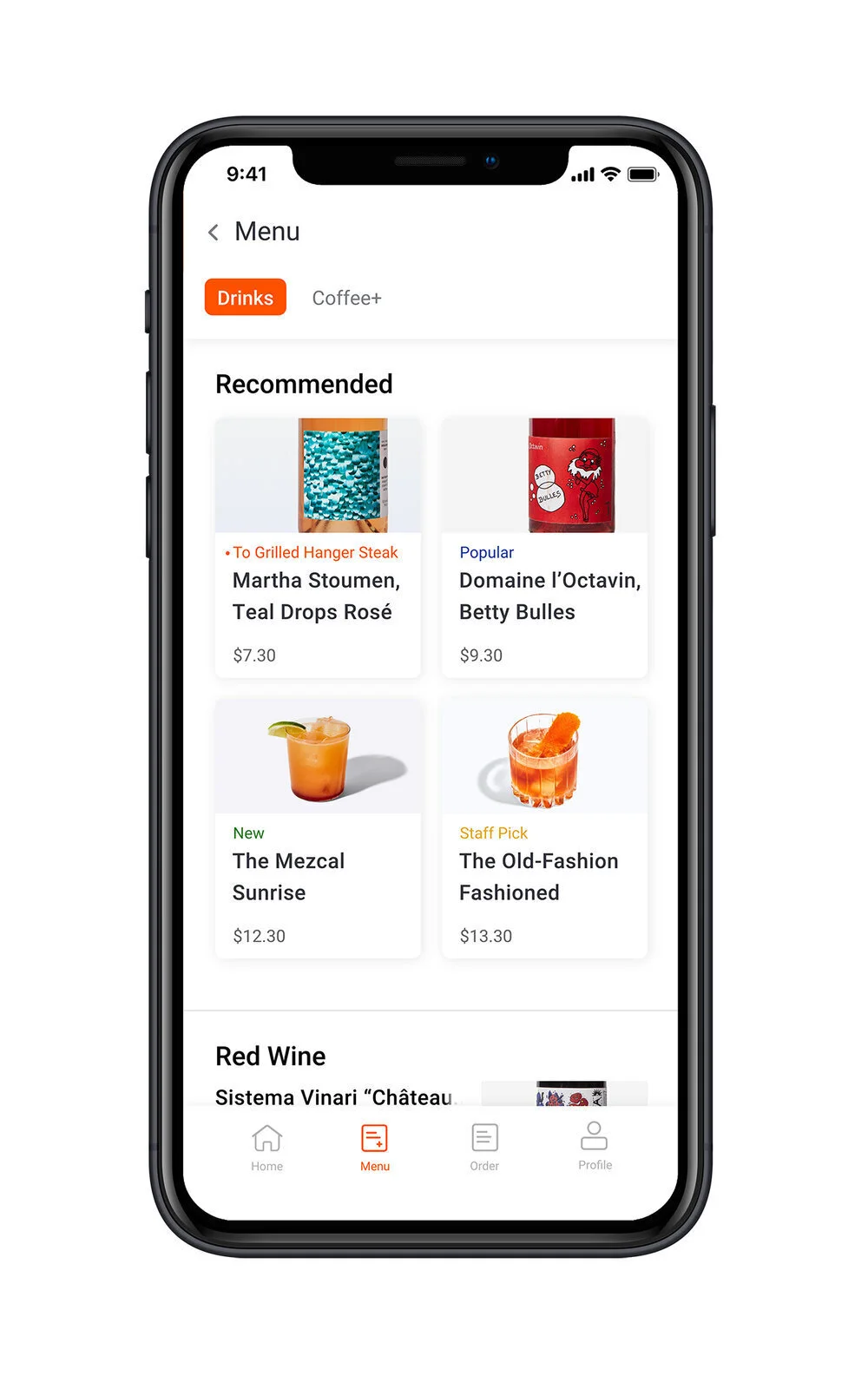
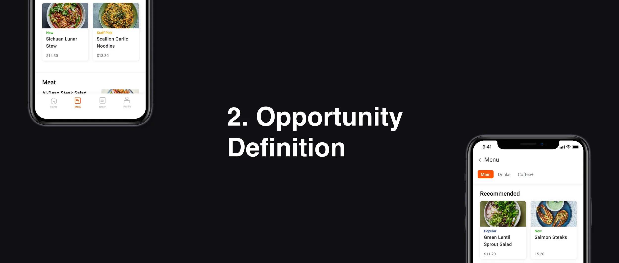
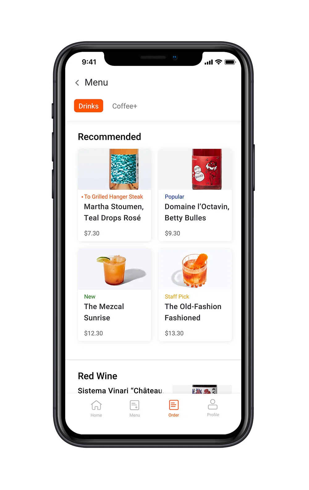
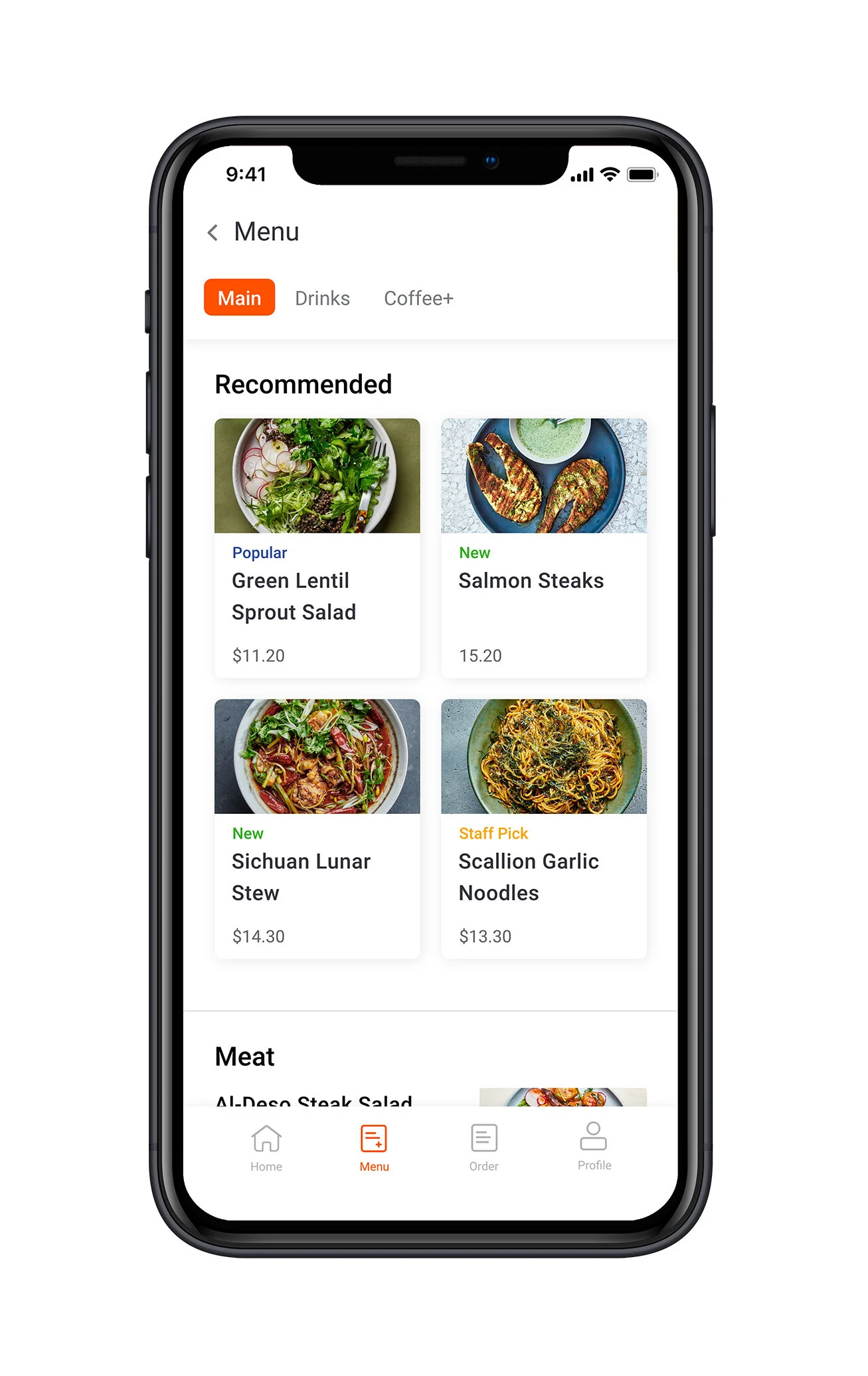
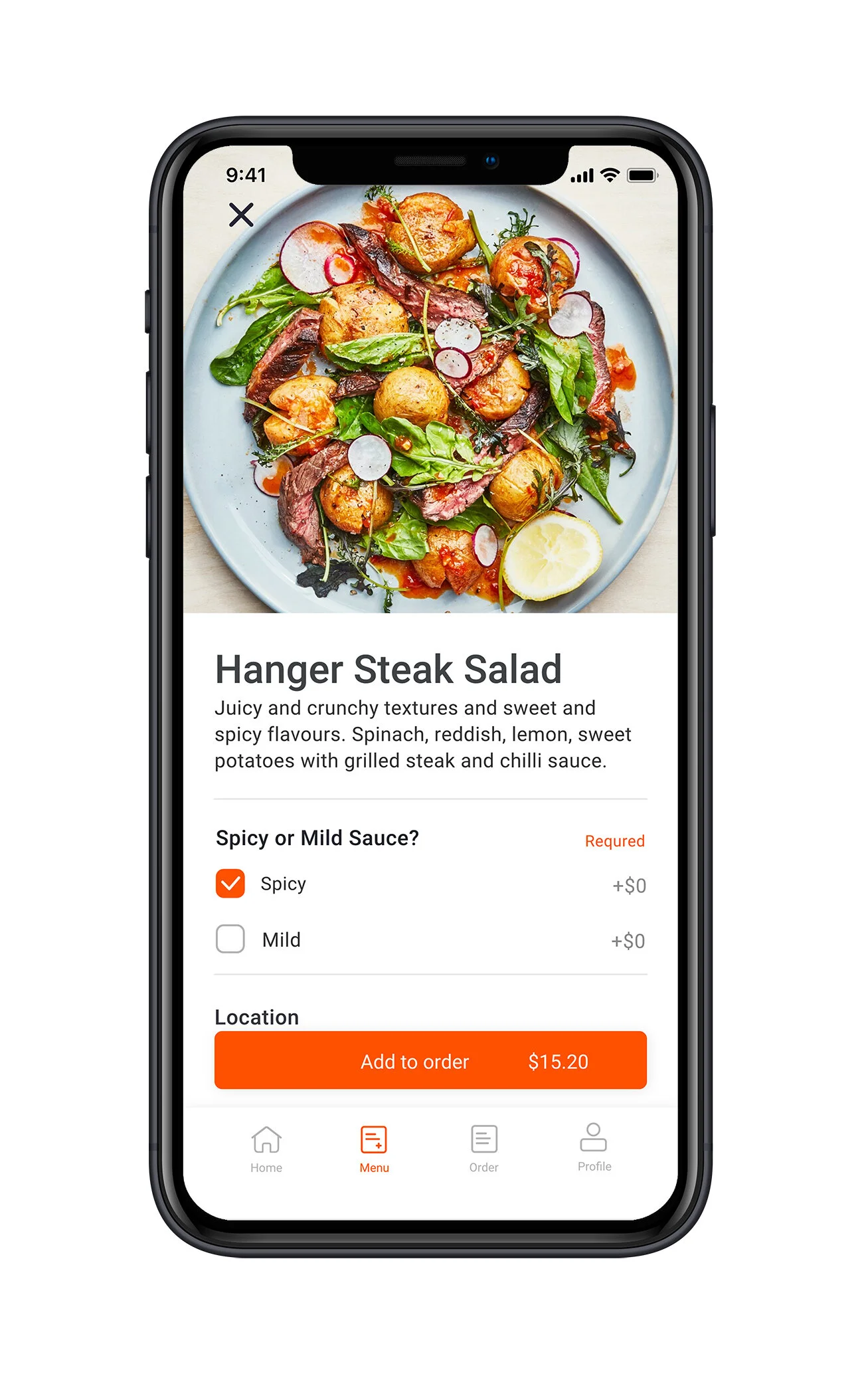
Recommendations – Personalized and categorized to make picking easier.
Like a sommelier, Parlé recommends items complementing users-picks. Also featuring items based on friends activity, popularity, staff favorites and recently added.
Helping users pick quickly and increasing the likelihood of adding one meal and drink per category.
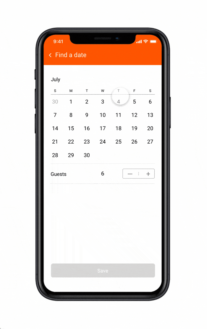
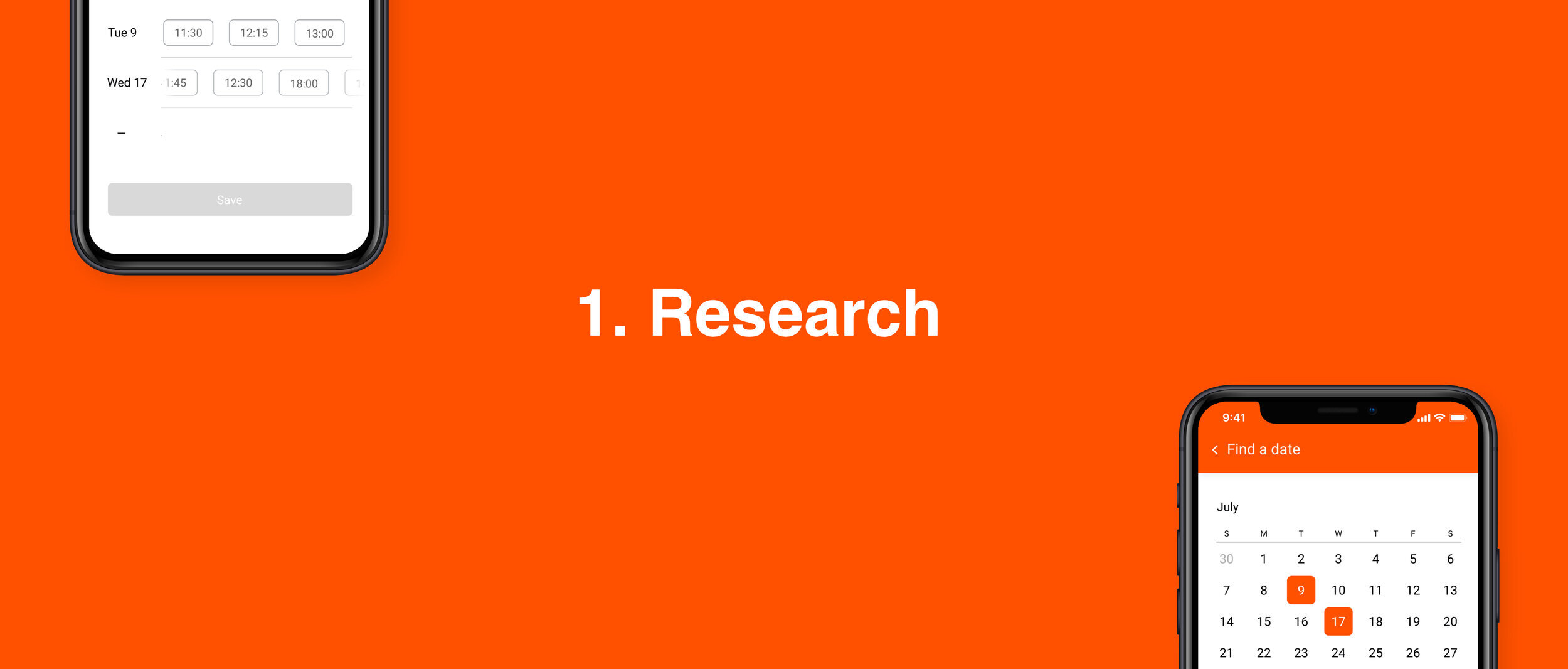
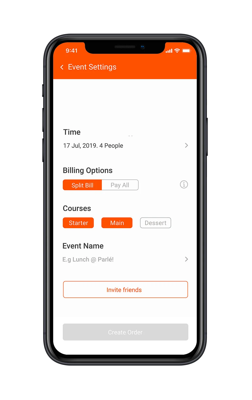
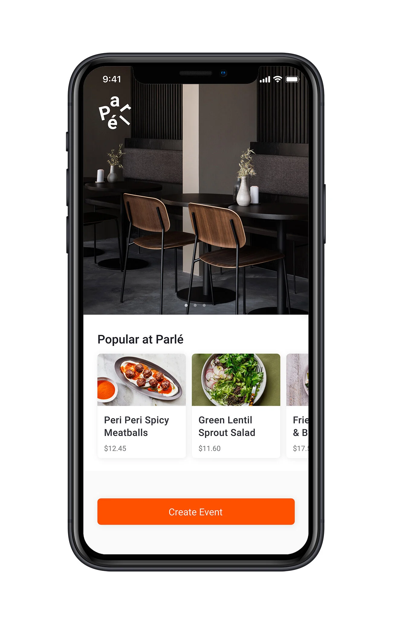
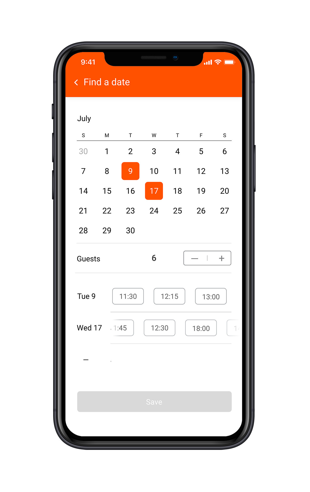
Booking – Compare multiple options with ease.
This design makes coordinating with multiple schedules easier by enabling users to view and compare multiple options simultaneously, without entering a new search in a pop-up or on a second screen.
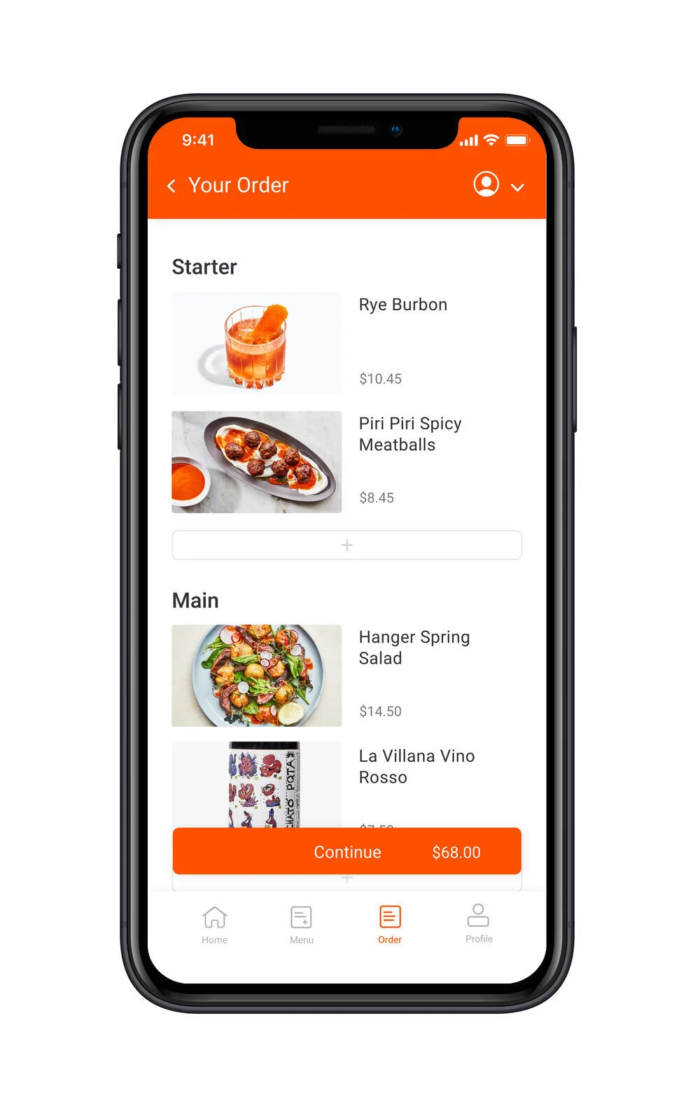
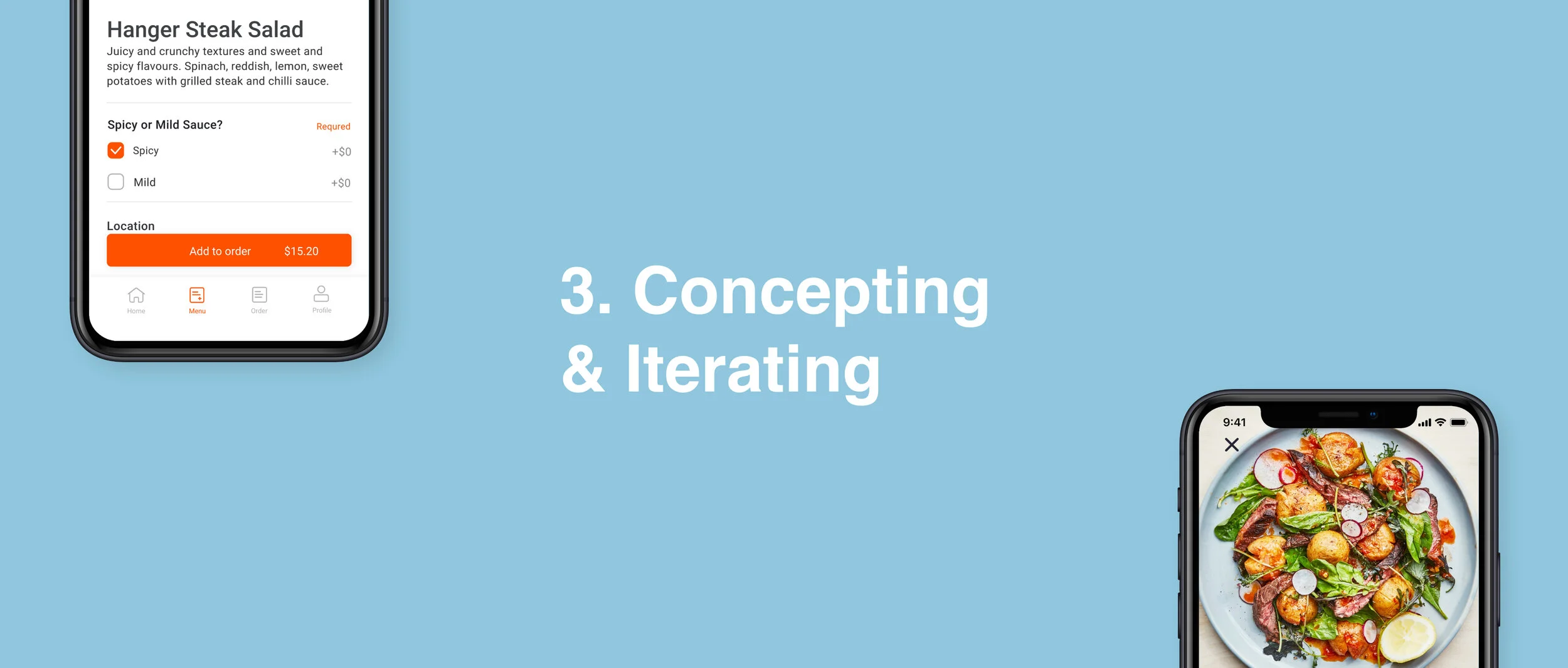
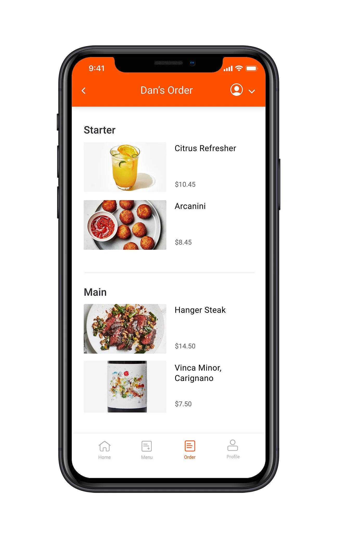
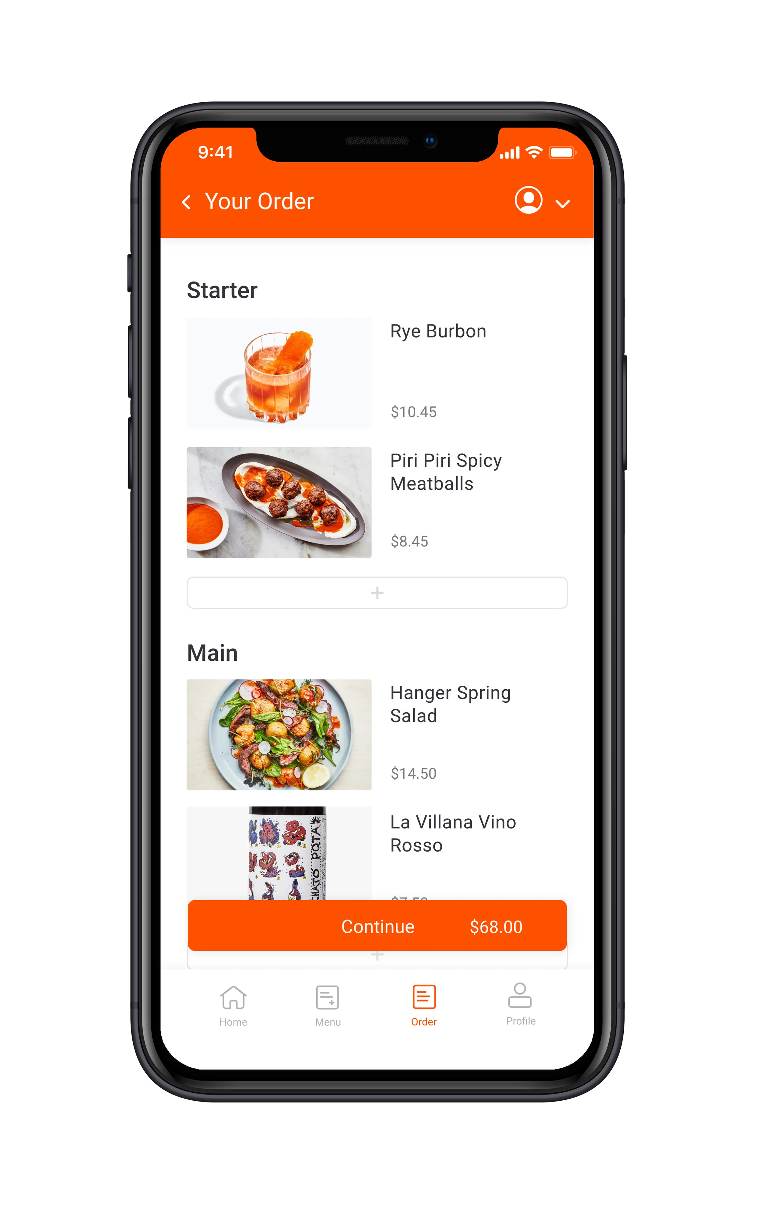
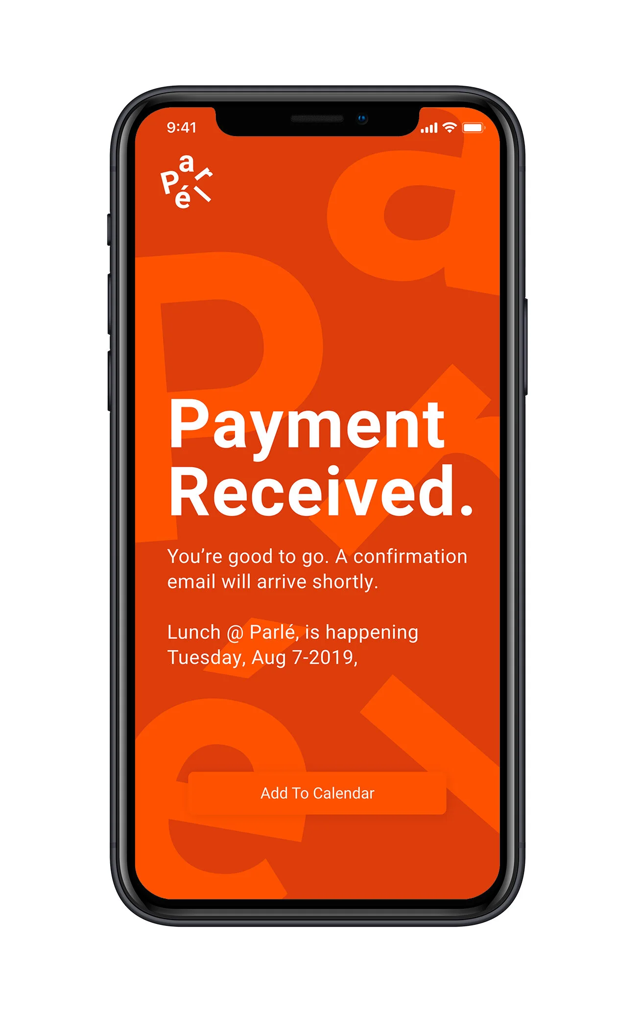
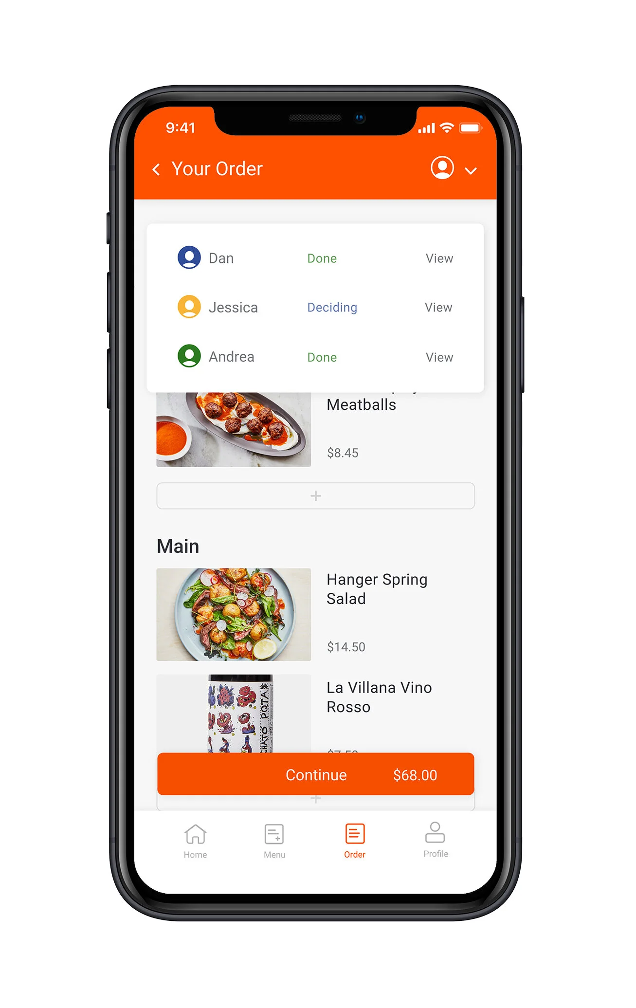
Order Page – Using images to reassure, excite and nudge.
Presenting user-picks in course-categories with large images in a timeline-like format provides clarity. It also makes users perceive each course as a separate event that looks more complete if including one meal and drink per category.

Interview Insights
I conducted five semi structured interviews to learn about behaviors, likes/dislikes, and thoughts about eating together at restaurants:
Frustration–Sound, ordering and paying distracts.
Noise makes group conversations particularly difficult and bill splitting feels like a hassle, distracting from what matters, talking.
Desire–An experience without interruptions.
Not having to wait for a table, a great atmosphere where long conversations happen, and service so good it goes by unnoticed.
Goal–Social bonding, connecting over food.
Eating together presents an opportunity to hang out over an extended period of time, ultimately to grow closer and bond.

User Personas
Social Sara was created from interviews, while Teamlead Tim was added to represent an opportunity
— attracting businesses.

Social Sara
As an overworked Advertising Strategist, Sara is longing to reconnect with her group of friends.
A terrible chef but curious about new foods, she prefers restaurants over hosting at home, but feel that restaurants are often nosy and hectic, depriving her of serenity she needs and making deeper conversations difficult.

Teamlead Tim
Tim’s team seldom have time to relax, hang out and bond.
Wanting to foster a sense of community in his team, Tim’s tried team lunches but people seem to stressed to relax and fully enjoy their time together. He’s looking for an activity people will remember and make people relax.

Service Blueprint
I utilized user interviews and collaborated with an experienced waitress to map what a typical visit entails for customers and staff. Aiming to better understand the context needed to identify causes and spot opportunities.
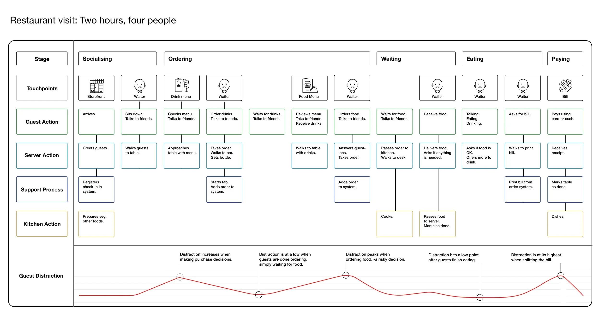
Service Insights
Customers spend 20% of their time distracted.
Customers spend one fifth of their time distracted, deciding, ordering or paying. Time that they’d prefer relaxing and talking.
Service Staff intervenes six times per table.
Service Staff scutters between tables, taking orders and checking in with guests. Often returning six-seven times per table.
Kitchen Staff stress due to demand guesstimates.
Kitchen Staff tracks inventory and anticipated demand, and prepares food, -activities that are manual, sometimes stressful, and mostly guesswork.

Problem Statement
How might we create a less distracting restaurant experience, enabling better conversations between groups of friends and colleagues?

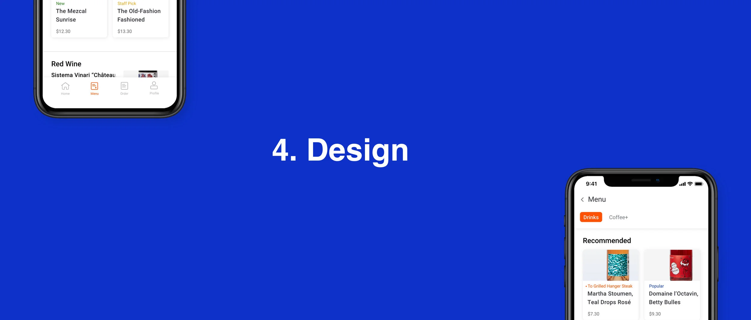
Design
Strategy
Making pre-ordering and paying part of the online booking process to remove distractions from inside the restaurant.
Enables better conversations
Creating a smooth, relaxed dining experience free from bill-splitting and decision making, focused on food and conversations.
Increases restaurant efficiency
By utilizing pre-order data to automate inventory management, enabling AB tested menus, integrations with bookkeeping and staffing software.
Improves sustainability and freshness
Eliminating guesswork and thereby food waste. Allowing chefs to spend more time planning meals and sourcing quality produce.

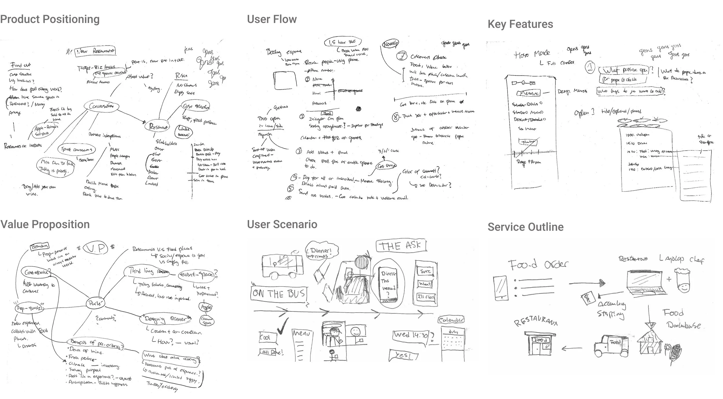
Ideation Sketches

User Testing
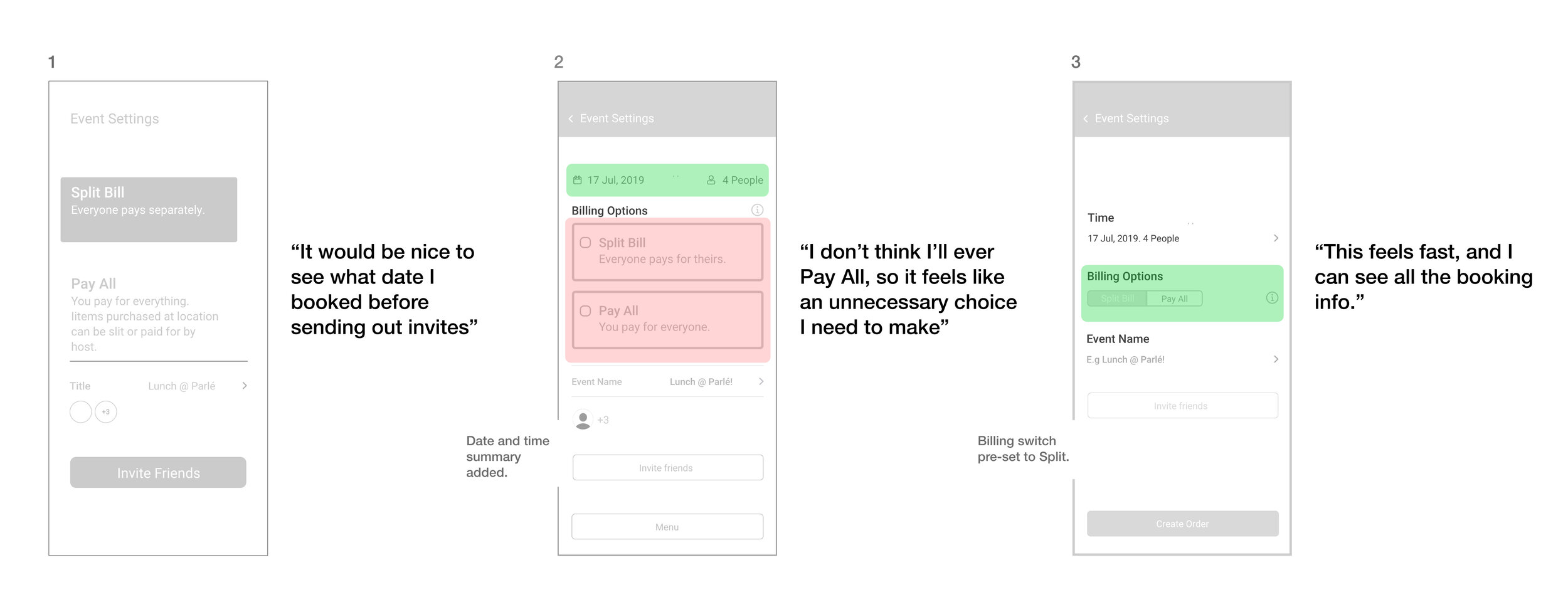
Payment Option Iteration
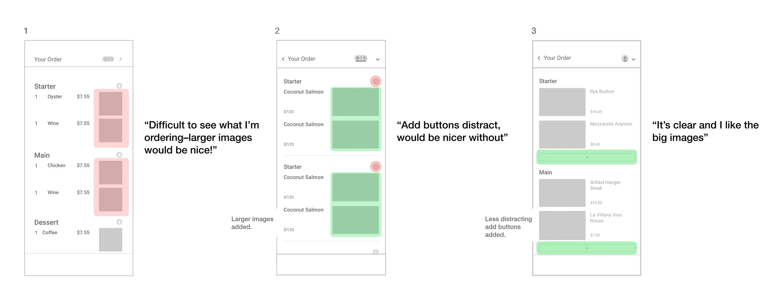
Order Page Iteration

Design Objectives
Nudge towards three meals and drinks
Research shows the best way to increase profitability is maximising spend-per-guest. Currently happening through upselling (Refills?) and nuding (Dessert?).
UI should build excitement and anticipation
The visual design needs to signal modernity and confidence, while, inspiring positive anticipation and excitement.
UX should make ordering simple and clear
Minimal effort needed to create menu worth looking forward to, and clear so users know what to expect from their pre-order.

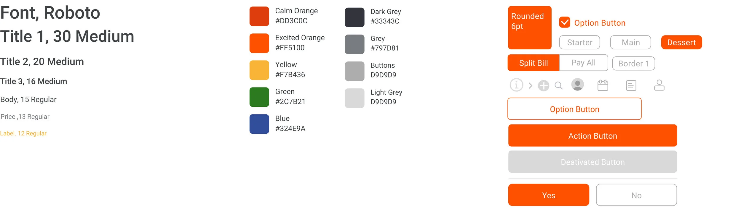
Design System
Mockup
A quick journey from account creation to payment confirmation. -And how to remove menu items.

All Screens

Reflections & Takeaways
Adopt patterns to avoid reinventing the wheel.
Next time, I'll spend more time researching and adapt established ux-patterns before designing new solutions, often ending up similar or inferior.
Spot faulty assumptions earlier by sharing ideas.
Not sharing the full idea with interviewees to avoid creating biases was correct but blinded me to my own faulty assumptions. Next time, I'll spend more time brainstorming with people before the initial research phase to spot biases and assumptions.
Momentum beats perfection
When designing, I sometimes got stuck moving pixels to perfect details rather than making real progress. Moving forward, I'll remind myself to not get stuck in details but to prioritize progress over perfection.