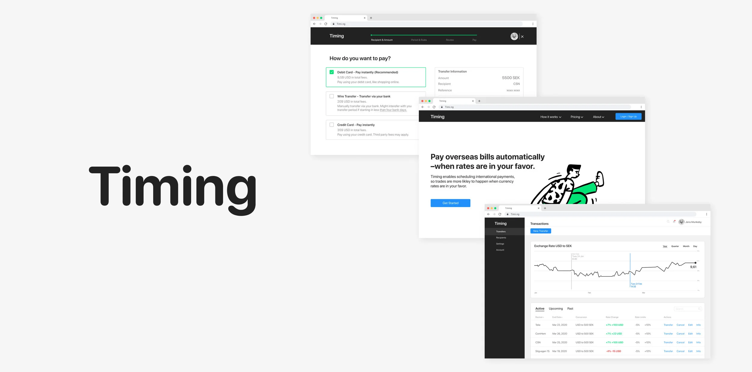
Timing— Automates international payments, giving users a better shot at trading when exchange rates are favorable.
Summary
I helped friend create a concept demonstration for a financial product potentially being integrated with an existing product suite.
Timing enables scheduling international payments, giving users a better shot at transfering money when exchange rates are in their favor, by creating rules so that trades happen automatically.
Feb-Mar 2020. UX & UI Design, Illustrator, Photoshop, Figma.

Key Features
Automatize payments to occur when exchange rates are favorable.
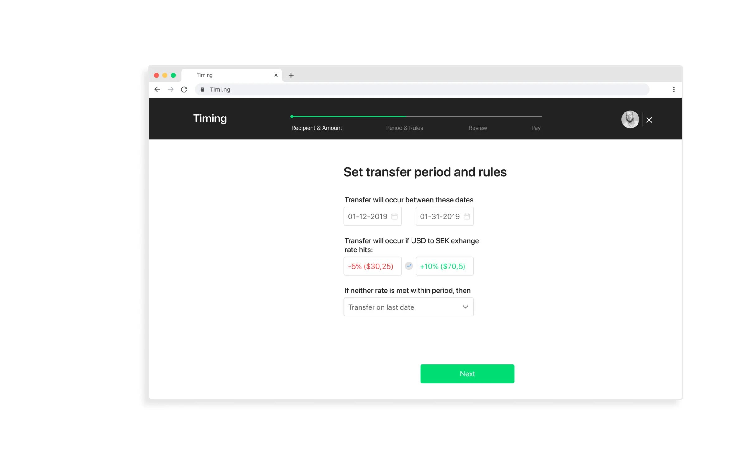
Users create trading windows and decide at what exchange-rates money should be transferred
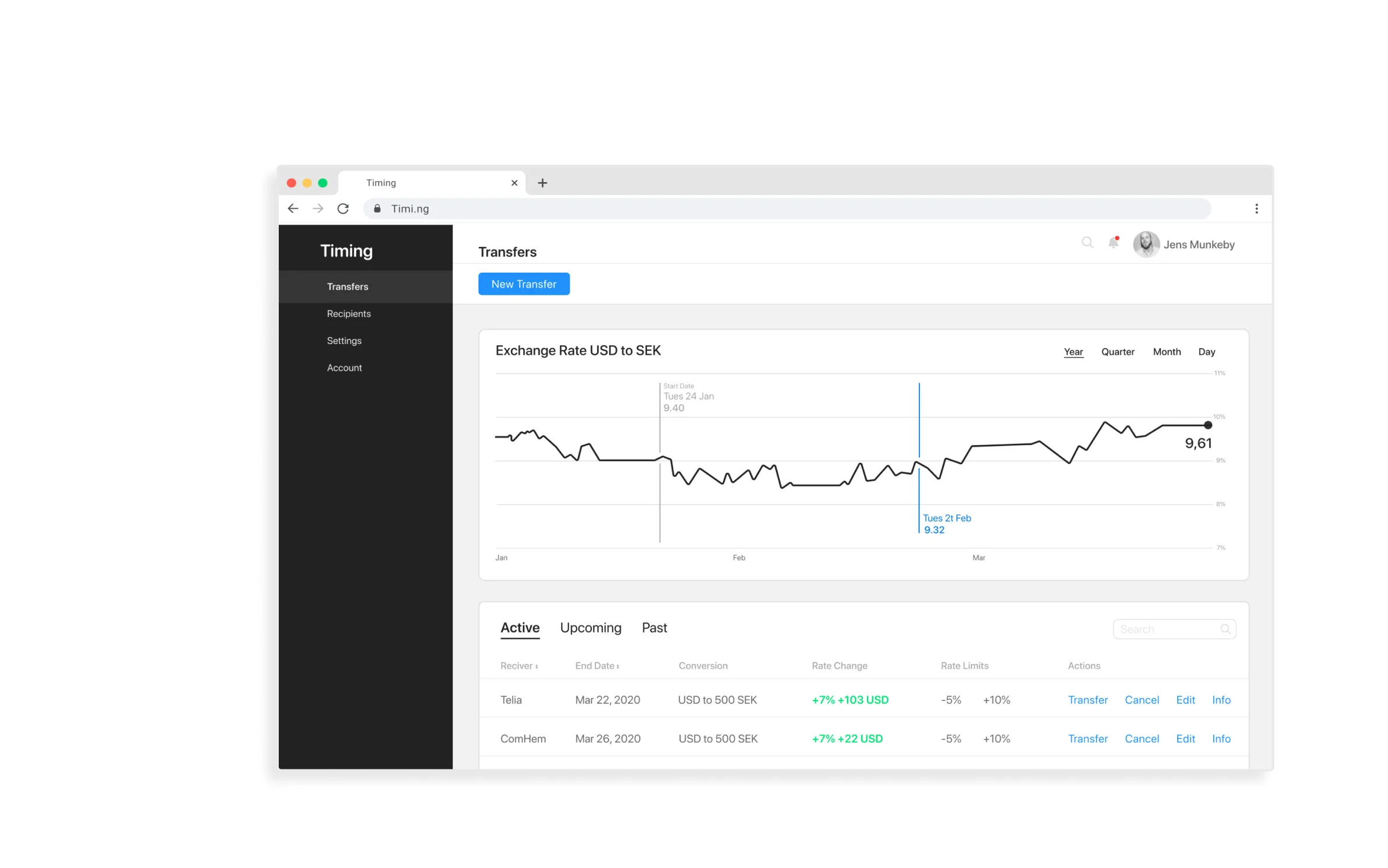
Monitor exchange rates and active transfers. –Edit if needed.
Users can also transfer and cancel immediately.

Product Goal: Enabling users to schedule international payments to occur when exchange rates are favorable.

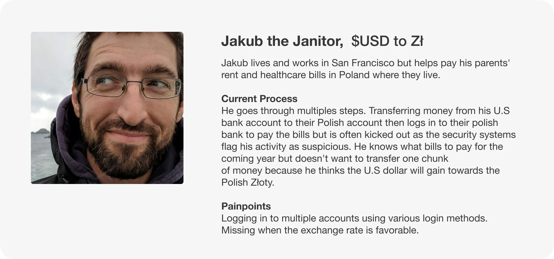
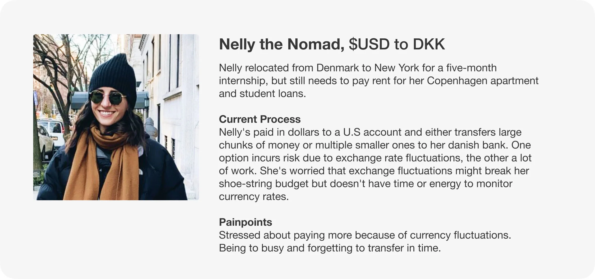
User Personas

Ideation
Knowing the product goal, I set out to explore features that could enhance product offering and designs to make the customer journey more efficient.
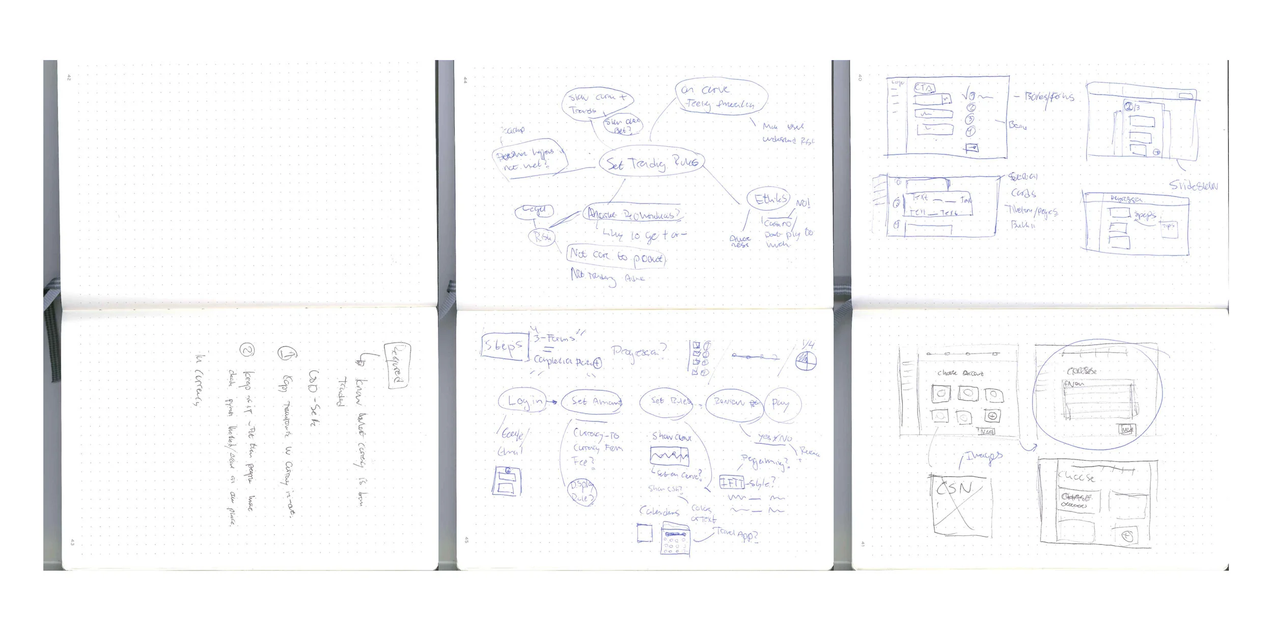

Flowchart & Wireframes
Using insights from ideation, I created wireframes.


User testing & Iterations
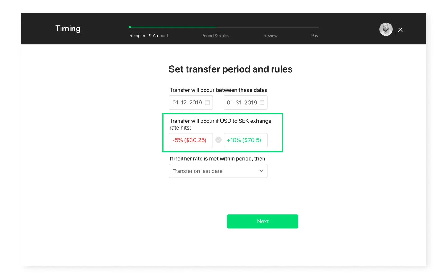
Exchange Rules
Percentages alone seen as abstract and confusing
Users expressed some confusion over what the percentages mean, saying it felt abstract but made sense after a little thinking.
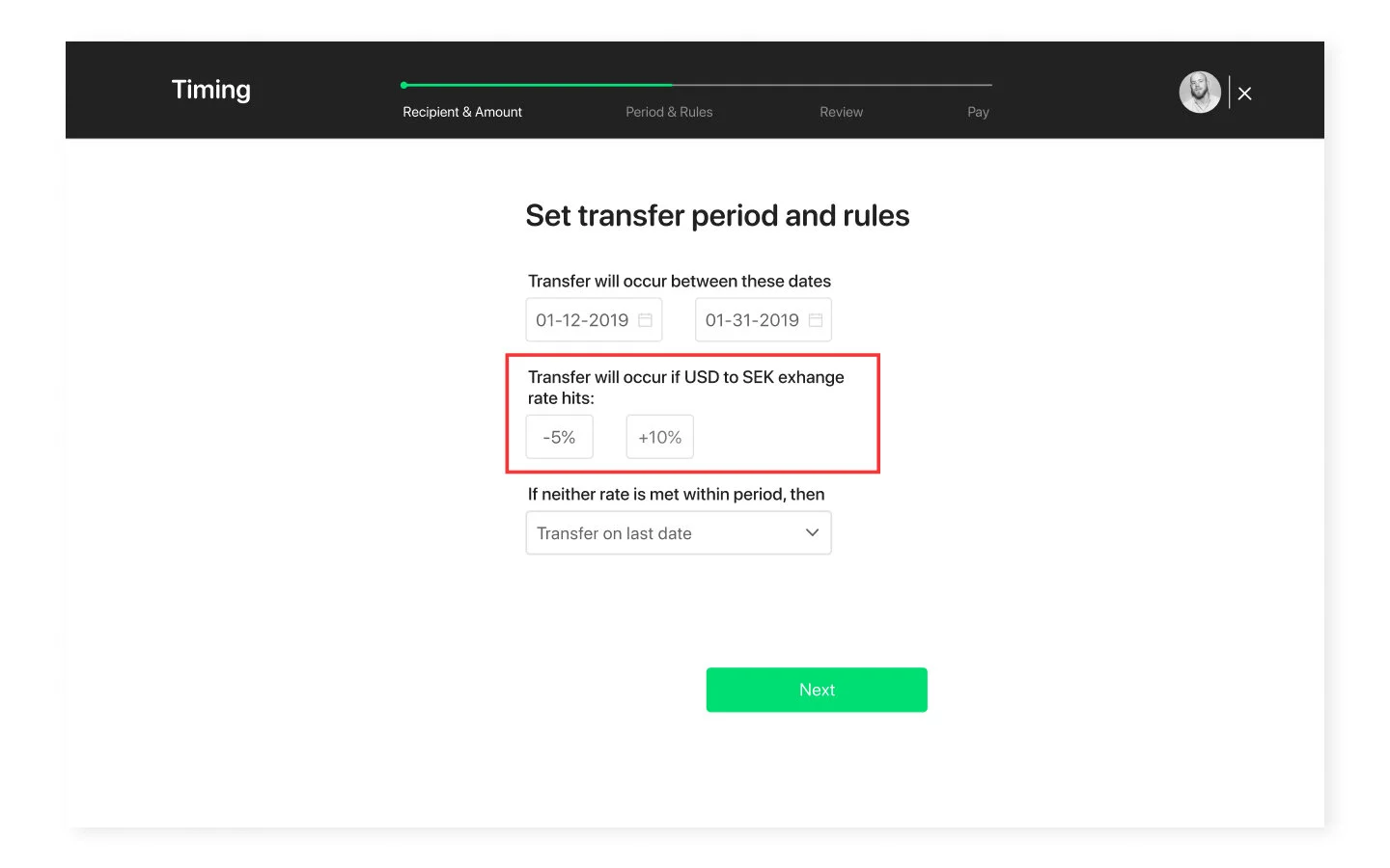
Turning abstract % into concrete $ brought clarity
Keeping the percentages and adding corresponding dollar amount lessened confusion. One user thought it still felt a little abstract.

Adding color reinforced the notion of loss & gain
Adding red for negative and green for positive helped users visualize what the percentages and amounts mean in an economic setting. Users said thet got it immediately.
Transfer Board
Colorful labels grabbed too much attention
Users expressed the large labels caught their attention, distracting from other information on the screen.
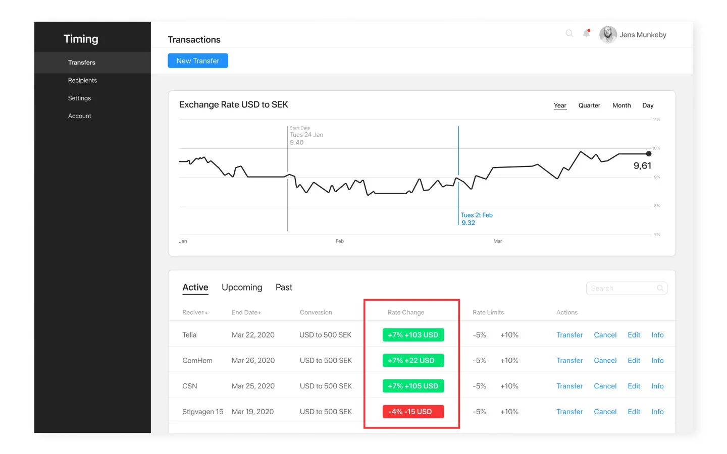
Colored numbers clear and less distracting
Smaller numbers were less visually dominant, and users said it felt calmer and was easier picking up other information.


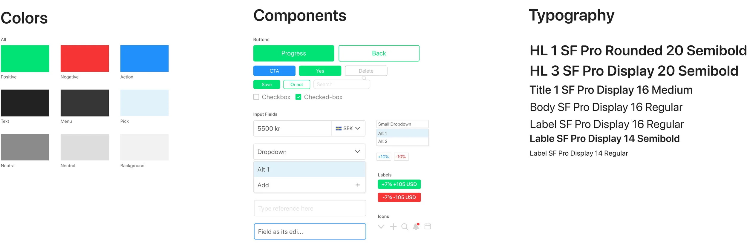
Design Concept
Smart, sleek, playful.
Smart, high contrast color combination that look sleek while playful to signal that Timing is new-kid-on the block financial service-